In this tutorial series you are rebuilding the GitHub Example App. Last time you presented a list of user repositories. This time you will allow the user to view issues.


Add a new page to the app, choosing no config elements and giving it the name “Issues”.
Pass Selected Repo Data
This page will need the repo selected in the list on the previous page – in Page Variables on the right, add five new variables, all with Swift / Java String type and each one with Is required during inbound navigation checked. Use the following names:
- “owner”
- “repo”
- “stars”
- “forks”
- “issues”
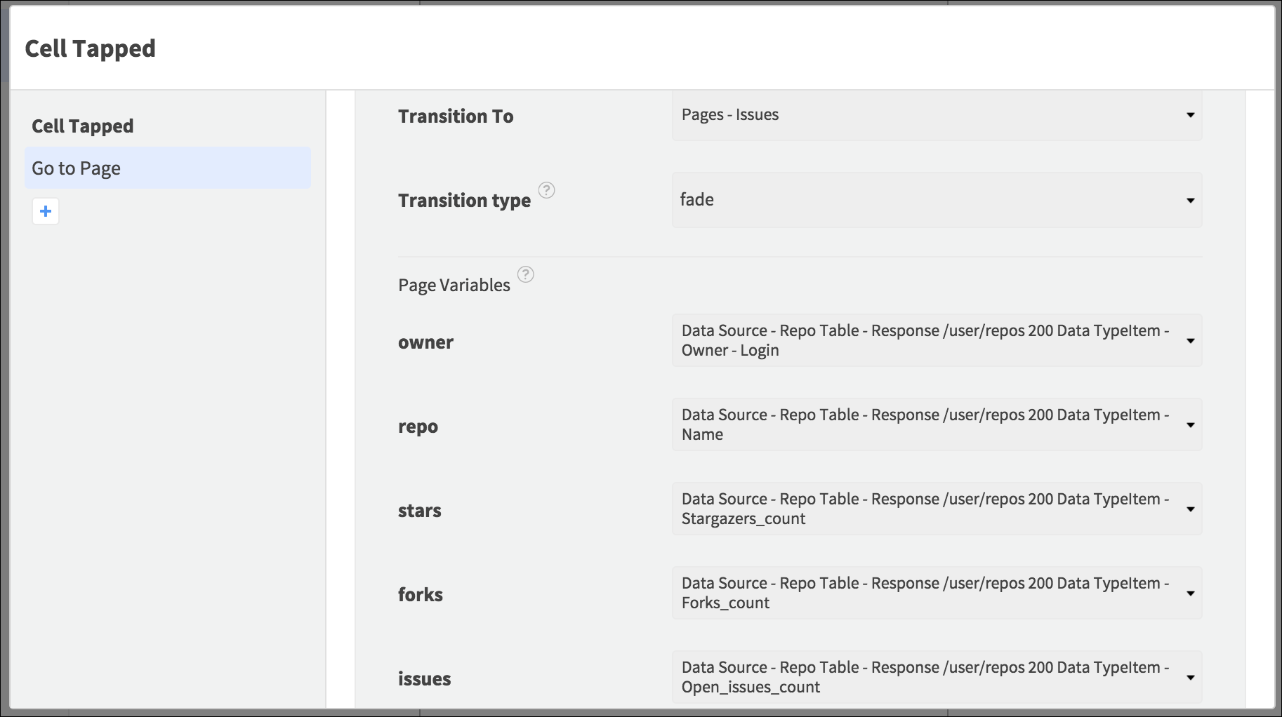
Back in the Your Repositories page, select the Table Cell / List Tile and open Properties > Events. Open the Tapped Event and add the Go To Page Action. Select the Issues page, the fade transition, and the repo details from the Data Source entry bound to the Element ( Data Source - Repo Table/List - Response /user/repos 200 Data TypeItem):
- Owner - Login for the owner variable
- Name for the repo variable
- Stargazers_count for the stars variable
- Forks_count for the forks variable
- Open_issues_count for the issues variable
Open the Issues page again.
Display Repo Information
The top section of the page will display navigation controls and the repository details that were shown inside the Cell / Tile in the repo list. Add a View Element, rename it “Header View”, and position it to occupy about a quarter of the page height. Set a background color to distinguish the different sections of the page.

Inside the View, on the left and near the top, add a Button / Text Button, renaming it “Back Button”. Set the Text to “Back”, give the Button a transparent background, align the text left, and add any other styling you like.
Add another Button / Text Button at the same height but on the right of the View, naming it “New Issue Button”. Set its Text to “New Issue”, align it to the right, and apply the same other styling properties as the previous Button.
Still inside the View, add a Text View under the Buttons, naming it “Repository Name Text View”, and making it occupy most of the width of the View. Set the text to “Repository Name” and choose a bold font to make the name prominent.
Under the Name text, add the same Elements you used on the repository list, presented in a line as they are in the Cell / Tile (you can copy/paste them from the repo list page):
- Stars
- An Image named “Star Image” with the star asset you used before
- The text “Stars”, with the Element named “Star Label” / “Star Text View”
- The text “0”, with the Element named “Star Count Label” / “Star Count Text View”
- Forks
- An Image named “Fork Image” with the fork asset you used before
- The text “Forks”, with the Element named “Fork Label” / “Fork Text View”
- The text “0”, with the Element named “Fork Count Label” / “Fork Count Text View”
- Issues
- An Image named “Issue Image” with the issue asset used before
- The text “Issues”, with the Element named “Issue Label” / “Issue Text View”
- The text “0”, with the Element named “Issue Count Label” / “Issue Count Text View”
Setup Placeholders
While the app is loading the issues, it will display some placeholder content. Under the View, near the center of the page, add an Image Element, naming it “Placeholder Image”. Set the image asset to the issues image you used before, choosing aspect scale, a transparent background, and scaling the Image to around a quarter of the page width, with the same width and height.
Under the Image, add a Label / Text View, naming it “Placeholder Label” / “Placeholder Text View”. Set the Text to “No Issues” and position the Element in the center horizontally. Use the same color to tint the Image and color the text.
Above the Placeholder Image, add an Activity Indicator / Progress Circle.

Display Issue Info
On top of the placeholder Elements, add a Page Controller / View Pager, making it fill the page from the Header View to the bottom, hiding the placeholder info. Name the Element “Issue Page Controller” / “Issue View Pager” and choose Dynamic Content / Pager Type.
Inside the Page Controller / View Pager, add a single Page Controller View / Pager View, naming it “Issue View”.
Near the top left of the new View, add an Image, naming it “Avatar Image”. Scale it to accommodate a small icon image – it will display the issue reporter’s avatar. Set the image asset initially to the GitHub logo you used earlier.
To the right of the Image, add a Label / Text View, naming it “Username Label” / “Username Text View”. Scale it to occupy most of the remaining page width and a single line of text. Set the Text initially to “Username”.
To the right of the username text, near the edge of the page, add a Button / Image Button, naming it “Menu Button”. Use this image asset:
Set aspect scale, choose a transparent background, and size the image to be around the height of a line of text.

Add a Label / Text View under the username details, naming it “Issue Title Label” / “Issue Title Text View”. Make it occupy most of the width of the page, with a large font size so that the title stands out. Set the Number of Lines property to two in case the title has more than a few words in it. Set the Text initially to “Issue Title”.
Add a Text View under the issue name text, naming it “Issue Body Text View” and scaling it to occupy most of the width, and most of the remaining height, with some space below it for other Elements. Give the two text Elements different font styles.
Under the body text Element, add an Image on the left of the View, naming it “Comments Image” and scaling it to square, around the height of a line of text. Set the image asset to the comments image:
Set the Image to aspect scale and give it a transparent background.
To the right of the comments Image, add a Label / Text View, naming it “Comments Label” / “Comments Text View”. Set a small font size and the Text “Comments:”.
To the right of the comments text, add another Label / Text View, naming it “Comment Count Label” / “Comment Count Text View”. Set the Text to “0” but scale the Element to accommodate larger numbers.
Under the comments Elements, add a Button / Image Button, naming it “Comments Button”. Scale it to occupy most of the page width, with the following image asset:

Choose aspect scale and a transparent background.
Your page should now look something like this:

Request Issues
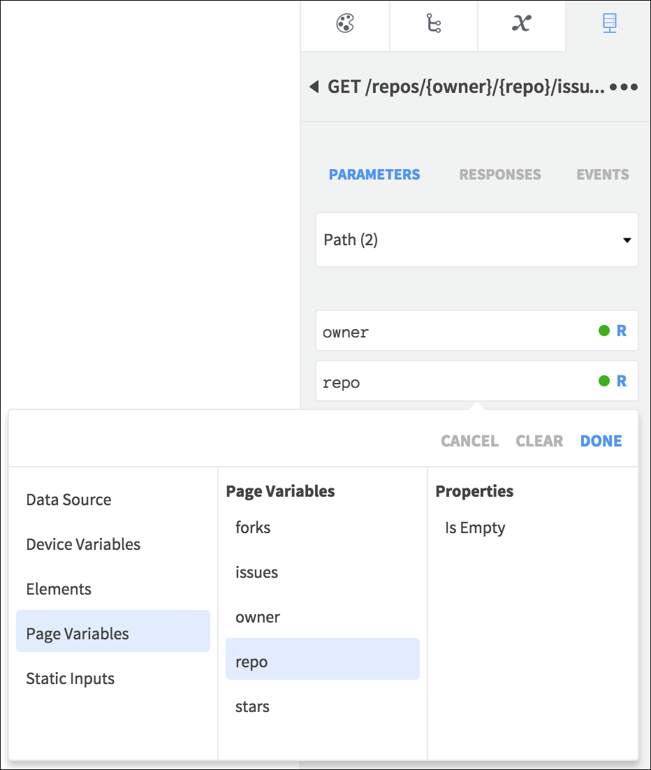
Now you can request the repo issue data from GitHub. In the API tab, add the GET /repos/{owner}/{repo}/issues endpoint as a new request in the page. Click to open it and select Path from the Parameters list.
For the owner and repo fields, select the Page Variables you added.
Select the Responses and bind the fields to the Elements as follows:
- The Data Source to the Page Controller / View Pager
- user - login to the Username text Element
- title to the Issue Title text Element
- body to the Issue Body text Element
- comments to the Comment Count text Element

Open the request Events. For the 401 Event, add a Go To Page Action navigating to the Login page, since the request has not been authenticated. For the 200 Event, add the Stop Animating an Activity Indicator Action on iOS, and on Android the Set Value Action, setting the Progress Circle Hidden property to true.
The user avatar will need to load slightly differently. Select the View inside the Page Controller / View Pager and open Properties > Events. When the Data Source entry from the API loads into each View, the Load / Loaded Event will fire. At that point you can load the image into the app for display. Open the Load / Loaded Event and add the Display Image from URL Action. Select the Avatar Image and retrieve the URL from the API response: Data Source - Issue Page Controller / View Pager - Response /repos/{owner}/{repo}/issues 200 Data TypeItem - User - Avatar_url.
The API request can run when the page appears – you can display the repo information when that happens as well. Select the page in the Element Tree and open Properties > Events. Select the Appeared / Resume Event. Add the following Actions:
- Run API Request, selecting the GET request
- Set Value, setting the Repository Name text Element Text to the repo Page Variable
- Set Value, setting the Fork Count text Element Text to the forks Page Variable
- Set Value, setting the Issue Count text Element Text to the issues Page Variable
- Set Value, setting the Stars Count text Element Text to the stars Page Variable
You can test the app at this stage and select a repo in the list to see its issues. Swipe between the issues to view the details. Next time you will add a page to view comments, and will revisit this page to build the functionality on the buttons.