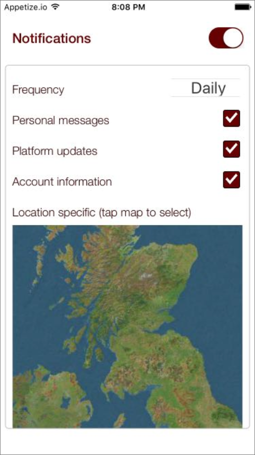
You can use the Set Value Action to toggle both user interaction and Element appearance while your app runs. Your app can detect interaction with any Element you like to toggle the other Elements on and off, but for a standard, familiar experience, add a Switch Element to your page.
- Add the Elements you want to toggle on and off. You can use whatever Elements you need to capture the user information you’re looking for. If you want the Elements to initially be available for use, use the settings in Properties > Styles to make sure they’re enabled for user interaction and fully visible.
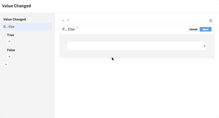
- Select your Switch Element on the page and open Properties > Events. Open the Value Changed Event.
- Click the plus
 button to add an Action, selecting If… Else. Edit the Action and test whether the Switch has been turned on or off:
- In the first input, select the Switch On property via the Event Data.

- In the center input, select == to check for equality.
- In the third input, select a Static Input Boolean value of
True .

Save the Action.
- In the first input, select the Switch On property via the Event Data.
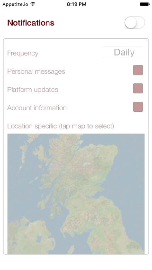
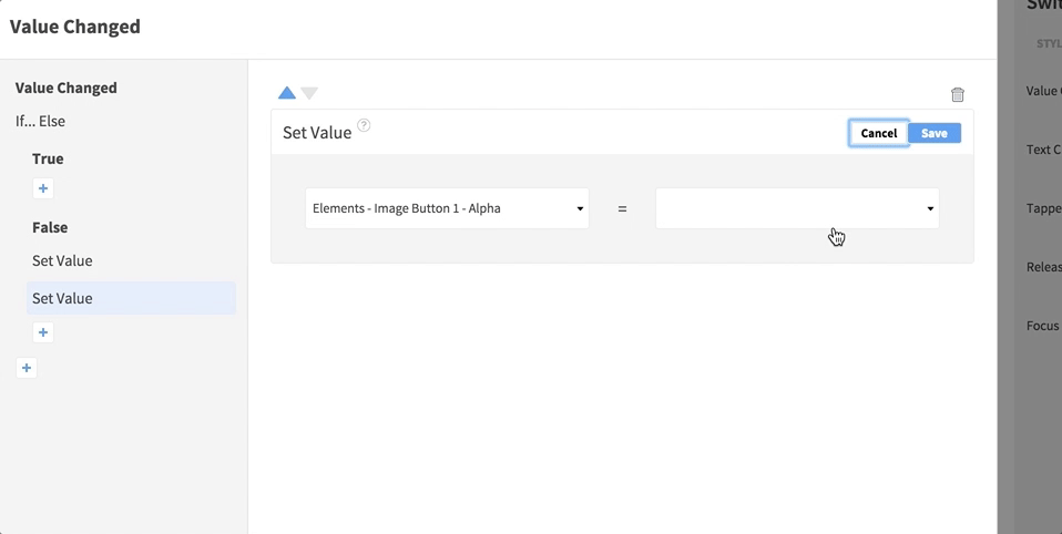
- First set what should happen when the switch is turned off, then you’ll come back to what happens when it’s turned on. In the nested False Event, add Set Value Actions to disable and alter the display of the Elements you’re turning off.
- For each interactive Element, add a Set Value Action – choose the Element from the Elements container, selecting the Enabled or User Interaction Enabled property, and set it to a Static Input Boolean value of False.

- Add more Set Value Actions for each element you want to alter the appearance of when it’s disabled, for example by setting alpha or text / background color properties.

- For each interactive Element, add a Set Value Action – choose the Element from the Elements container, selecting the Enabled or User Interaction Enabled property, and set it to a Static Input Boolean value of False.
- Next set what should happen when the switch is turned on. In the nested True Event, add a Set Value Action corresponding to each one you added in the False Event, setting the enabled and style properties back to their original values.

If you have a lot of Elements you’re toggling on and off it may help to group them inside a View – you can then set style properties (such as alpha) on the containing View and it’ll apply to the contents. If you prefer to completely hide the Elements when they’re disabled you can alternatively toggle the Hidden property. You can also set Elements enabled or disabled according to the results of an API request by adding your Set Value Actions to response Events.


You can use the Set Value Action to toggle both user interaction and Element appearance while your app runs. Your app can detect interaction with any Element you like to toggle the other Elements on and off, but for a standard, familiar experience, add a Switch Element to your page.
- Add the Elements you want to toggle on and off. You can use whatever Elements you need to capture the user information you’re looking for. If you want the Elements to initially be available for use, use the settings in Properties > Styles to make sure they’re enabled for user interaction and fully visible.
- Select your Switch Element on the page and open Properties > Events. Open the Value Changed Event.
- Click the plus button to add an Action, selecting If… Else. Edit the Action and test whether the Switch has been turned on or off:
- In the first input, select the changed value via the Event Data.
- In the center input, select == to check for equality.
- In the third input, select a Static Input Boolean value of
True .

Save the Action.
- In the first input, select the changed value via the Event Data.
- First set what should happen when the switch is turned off, then you’ll come back to what happens when it’s turned on. In the nested False Event, add Set Value Actions to disable and alter the display of the Elements you’re turning off.
- For each interactive Element, add a Set Value Action – choose the Element from the Elements container, selecting the Enabled property, and set it to a Static Input Boolean value of False.

- Add more Set Value Actions for each element you want to alter the appearance of when it’s disabled, for example by setting alpha or text / background color properties.
- For each interactive Element, add a Set Value Action – choose the Element from the Elements container, selecting the Enabled property, and set it to a Static Input Boolean value of False.
- Next set what should happen when the switch is turned on. In the nested True Event, add a Set Value Action corresponding to each one you added in the False Event, setting the enabled and style properties back to their original values.

If you have a lot of Elements you’re toggling on and off it may help to group them inside a View – you can then set style properties (such as alpha) on the containing View and it’ll apply to the contents. If you prefer to completely hide the Elements when they’re disabled you can alternatively toggle the Hidden property. You can also set Elements enabled or disabled according to the results of an API request by adding your Set Value Actions to response Events.