Build your app design on each page by choosing from the Elements drawer on the left, and use Properties on the right for styling.
If you don’t see the Element you need, you may be able to achieve what you’re looking for via a Plugin.
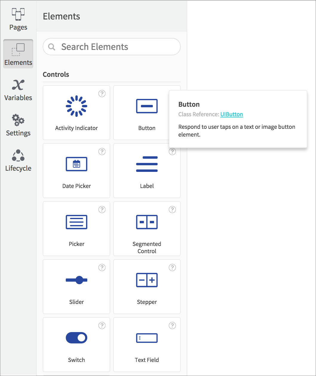
Each Element represents a native iOS or Android class, allowing you to display information and media, to capture user input, and to create the experience you need. Hover over an Element to see info on it together with a link to its class reference.
Elements with text and number values can display API response data, and to display an array from an API you can use any of the dynamic elements.
Drag Elements onto the Canvas, where you can resize and position by clicking and dragging an Element or its handles.

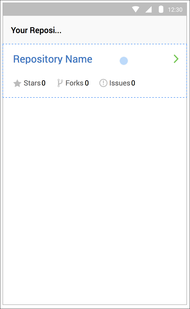
You can place certain Elements inside others, creating parent and child relationships. You will see a dotted line around a valid parent Element on the Canvas when dropping a child Element.
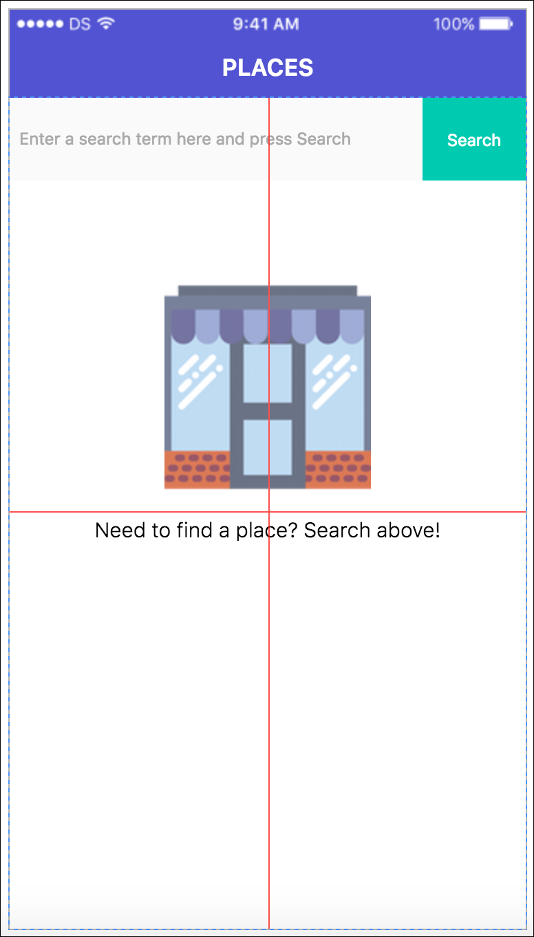
Use the smart guides that appear while dragging an Element to center or align its position.
You can switch smart guides on or off using the Preferences button that appears to the bottom right of the Canvas.

Use the checkbox to toggle smart guides on or off.

You can also use the Element Tree on the right to manage the structures within your page.
Styling Elements
With an Element selected on the Canvas (or in the Element Tree on the right), set its styling and layout constraints in the Properties tab on the right.

It’s best to rename your Elements to make them easier to identify while working on your project, and to make your source code more readable – use the Rename button next to the Element name.

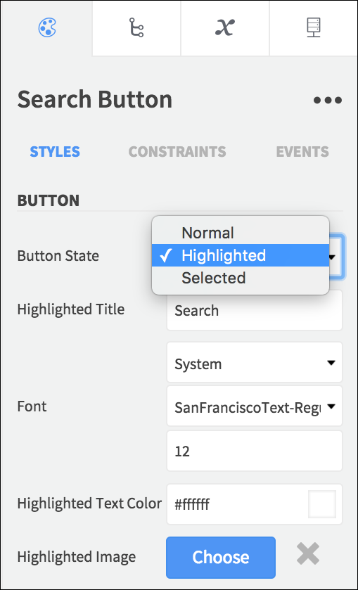
Use the Styles controls to customize the available Properties for the selected Element, which include text values, fonts, colors, and more.
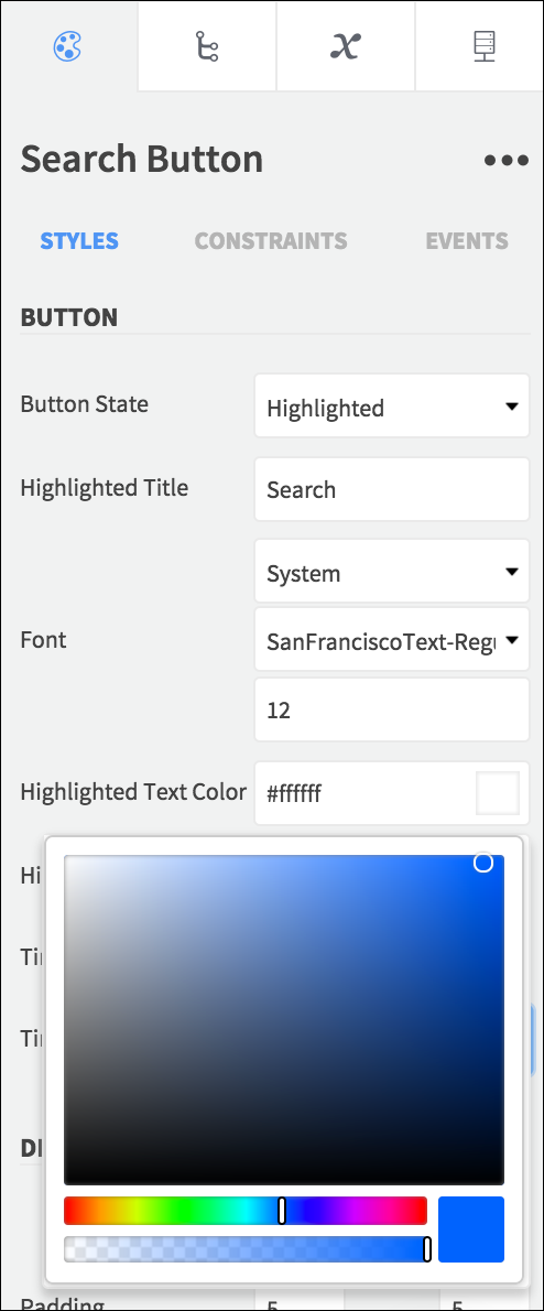
You can set certain Properties during user interaction states, to configure how an item will appear when selected or highlighted.
You can set Element properties while your app is running using the Set Value action.
Using Constraints
Use the Constraints section to set the position of an Element relative to its parent Element.

Choose a mode for your horizontal and vertical constraints, to position your Elements using left, right, top, bottom, width, and height values.

The selected mode determines which constraint inputs are editable.
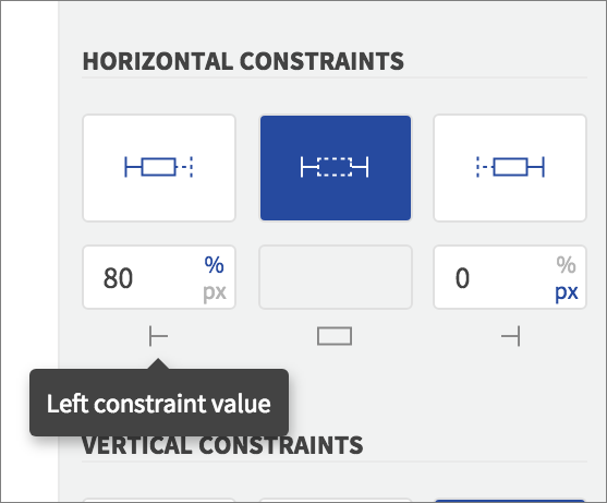
Use fixed values for constant positioning or relative values to create layouts that will scale to different screen sizes.

In some cases you cannot edit particular constraint values for an Element type because they are set by the OS/class definition.
When you move or resize an Element on the Canvas, your selected mode will remain the same, and the constraint values will update to reflect your changes.
When you’re ready to specify what will happen when the user interacts with an Element, you’ll use the Properties > Events section.